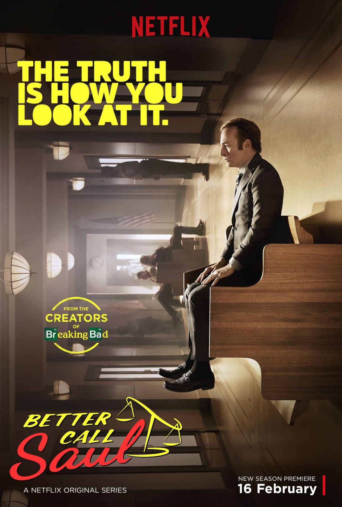
I realise that this is a provocative statement to make, when there are many worthy contenders. First and foremost there is the sequel Breaking Bad. Then there is The Wire that shows the gritty realism of nexus between the drugs mafia, police and politicians. Or take Game of Thrones, a monumental saga where Shakespeare meets Dostoyevsky at a party hosted by J R R Tolkien. All these shows, and many more that I have not mentioned are very, very good. And yet, I think Better Call Saul has an edge over all of them.
There are a number of reasons for this and I will mention them as I go along but the main reason is it’s cinematography. Recently, I watched an interview of a very accomplished Indian actor and he said that cinema is mainly an audio medium because it is the actors that breathe soul into the script. He is not entirely wrong but I am convinced that the visual part of cinema dominates over the audio part. I am sure hearing Daniel Day-Lewis recite Hamlet over the radio will be a memorable experience but watching him enact it aided by great camera work would be an unmatched experience.
With Better Call Saul, an apt comparison is with The Godfather and The Godfather Part II. Francis Ford Coppola and cinematographer Gordon Willis found beauty amidst crime, making every frame memorable. Admittedly, they were constrained by the technology at that time and by the fact that you can only show this much in 377 minutes.
Better Call Saul has the advantage of better technology and unlimited time – unlimited that is, compared to a 2-3 hour movie. Better Call Saul had a series of directors, starting from Vince Gilligan and Peter Gould who created the series to Thomas Schnauz, Adam Bernstein and many others. The cinematography was done by Arthur Albert and Marshall Adams. A very simple way to judge the cinematography of Better Call Saul (or any other show or movie) is to freeze any frame and look at it. Does it make a good, standalone photograph? I am convinced that many of the frame photographs of Better Call Saul would win the National Geographic photo contest. BuzzFeed has compiled 51 eye-catching frames from the show and there are many more. (No. 29 is pure Ozu and No. 32 is a nod to the famous Beatles album Abbey Road.)
Some of visuals of Better Call Saul are reminiscent of Yasujiro Ozu and his “pillow shots.” A pillow shot is a cutaway to an element in the landscape and it’s duration is long enough to let the viewer know about it. The show is full of not just pillow shots but some “pillow sequences” if you will – water running in basin, coffee mug falling on floor in slow motion. One of my favourite ones is in an episode in Season 5. Jimmy McGill (Bob Odenkirk) is walking on the street eating an ice cream cone. A car stops by, two mafia guys in it. They order him to get in. as he gets in the car he has to throw away the ice cream that falls on the footpath. Next episode starts with an ant, eating the melted ice cream that is followed by a swarm of ants all over it. All this is photographed beautifully with care and patience as if it’s a National Geographic documentary on ants. Or there are these black and white sequences at the beginning of many episodes that show Jimmy in his later life working in a confectionery shop. The visuals show pastry making, cleaning, baking in such beautiful detail that you almost forget for a moment about the plot and story line.
An important part here also involves the framing of each shot. There are many shots where you see the ‘rule of thirds‘ being followed quite religiously. The camera never misses to project the beauty of landscape. It also does not have any restrictions on locations. Top angle, zoom, wide angle, panoramic, camera inside a dustbin or in a ceiling and so on. In Episode 8 of Season 2, there is a scene of 4 minutes and 26 seconds without cut, that shows the border crossing between the US and Mexico. It reminds me of the battle ground scene in Atonement. This level of mastery is unprecedented for a TV show.
Now here’s what I find amazing. Ozu did pillow shots by the dozens but his plots were always about simple people living their everyday lives. There was no urgency in the story to advance at a rapid pace. Better Call Saul is just the opposite. It’s a crime drama that depicts transformation of a lawyer who gets involved with drug mafia. The story line is taut, with each episode ending on a tense note. And yet, not even once these visual getaways feel out of place. In fact, they add to the tension. How incredibly flexible the script must be to achieve this level of compactness so that it can allow the cinematographer such freedom.
I mentioned in the review of Breaking Bad that each of its characters were memorable with a strong backstory so much so that any of them could have their own spin-off series. An interview with Gilligan and Gould reveals that it was far from easy. They started thinking about Breaking Bad spin-off in 2009 and they started shooting in 2014. Benjamin Gilani said in his Rajya Sabha TV interview that creativity is like a plant. You have to water it, nurture it, put it in sunlight and give it time. The spectacular show that we see today took a lot of time and hard work to create.
It is this relaxed sense in the script that makes Better Call Saul different than any other show. The creators are not in a hurry to get to the next plot twist. This is reflected in the camera movement as well. Many of the scenes where two characters are talking, the camera simply observes them from a distance without moving, which is what Ozu did as well. But Ozu almost never moved the camera. In Better Call Saul the camera moves when it needs to but never unnecessarily. The slow pace of the camera introduces a different kind of slow paced storytelling that takes its own time but never loses its grip even for a second.
This is also evident while introducing characters. The usual way that this is done in TV shows or movies is in a hurry. The viewer is told about the necessary details of the characters through actions or conversations as soon as possible so that the story can move on to the next twist. In Better Call Saul, the character of Mike Ehrmantraut in properly introduced in episode 5 of Season 1. Before that we see him having brief conversations on his job as a parking attendant at the courthouse. Near the end of Episode 5, the camera stays on the entrance of the courthouse as night changes into early morning. Mike finishes his shift, goes to a diner and has breakfast. Then we see him parked in front of a house. A young woman comes out and stops to look at him as she drives by. Next we see Mike going to his house and sitting in front of the TV having a drink. There’s a knock, he opens the door and it’s the cops. I have never seen such a relaxed way of introducing a character and that too, in a tense crime drama.
There is not much original to say about acting (my limitation!) except that it’s top class. Bob Odenkirk is phenomenal as Jimmy McGill / Saul Goodman / Gene Takavic. Equally effective is Rhea Seehorn as Kim Wexler whose acting influenced the writers to change the storyline in subsequent seasons, much like Cosmo Kramer’s character played by Michael Richards did in Seinfeld. The so-called bad guys – although there are too many shades here to do a blanket categorisation (as Mike says “I’ve known good criminals and bad cops, bad priests, honorable thieves – you can be on one side of the law or the other, but if you make a deal with somebody, you keep your word”) – Michael Mando as Nacho Verga, Giancarlo Esposito as Gus Fring, Tony Dalton as Lalo Salamanca and Jonathan Banks as Mike Ehrmantraut fit the roles with so much perfection that it is impossible to imagine anyone else playing their roles.
This is the crux of the success of this show. Even though the creators did not plan it that way, every department has jelled together perfectly. Better Call Saul manages to attain the level of creativity that every artist, no matter what his field, should aspire to.


